Edison Mail

An email client built around user requests, clean easy-to-use designs, and great user experience. For users that want to connect the email they already have to a better UI than their provider.
Logo & App Icon
The Edison logo was crafted to be flexible and distinctive, scaling across the entire product family in the brand’s early phase while communicating a unified, confident identity.
The app icon should read clearly at a glance on the home screen. It should feel familiar, approachable, and instantly recognizable for those who want to link their existing accounts to something better than their operating system’s email app that comes on their device.
Iconography
Custom iconography created for use in the interface let us accommodate the app’s (and platform’s) specific needs giving us complete control over the look, feel, and usability.
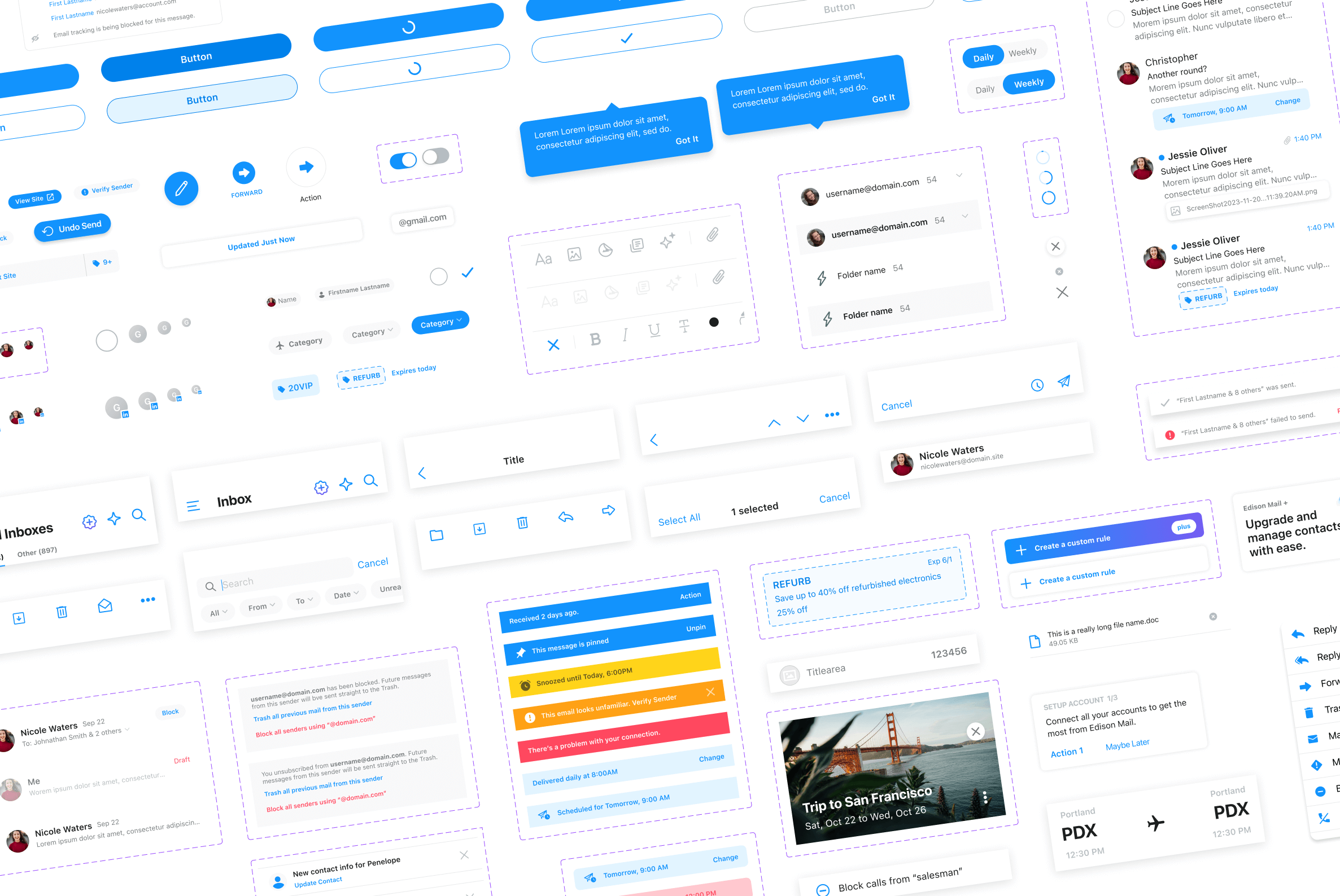
Design System
Design systems that span platforms create a shared knowledge base between engineering and product teams, enabling consistent, clean, and easy-to-use designs. Built on a 4px grid, with a cohesive color system, and typography styles, the Edison Mail design system consists of reusable elements that can be skinned according to placement and need, accommodating both light and dark system modes.
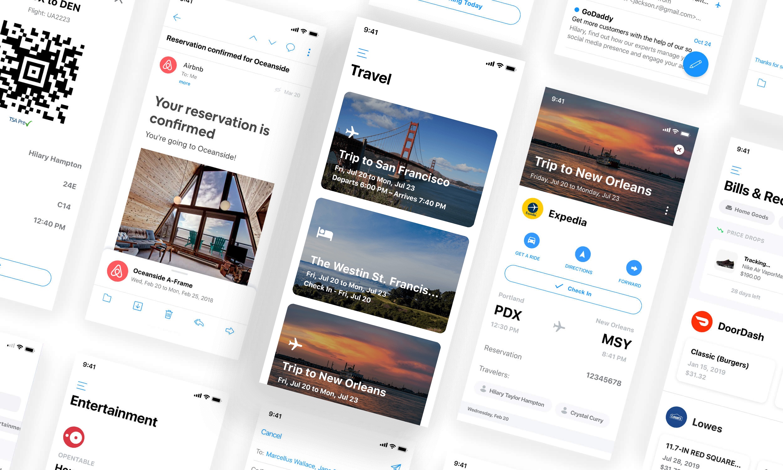
UI/UX
Edison Mail is an email client shaped by user feedback, offering a clean, intuitive interface and thoughtful features that prioritize speed and simplicity. It lets people connect their existing accounts to a smarter, more user-friendly UI than many default provider apps.
Download the app today.